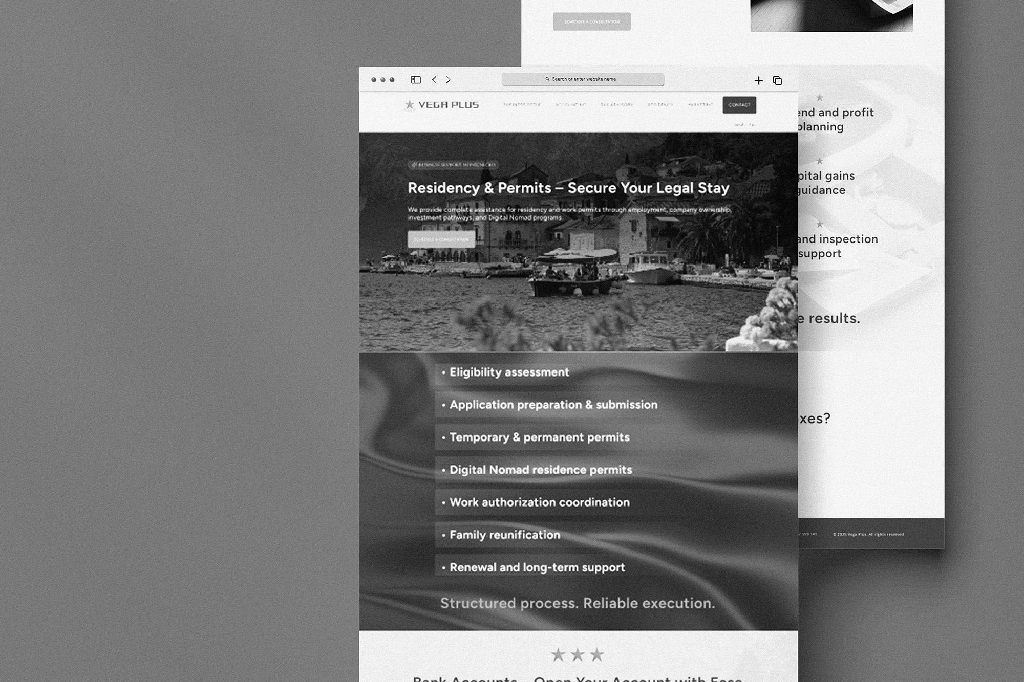
TM Law needed a professional yet approachable website that reflects their expertise and builds trust with potential clients. The goal was to design a modern, clear, and visually appealing digital presence, one that communicates reliability while feeling current and accessible. This case study highlights the process of designing the website in Figma.
I began with research, exploring competitor websites and identifying patterns in effective legal design. Clean, grid-based layouts and neutral tones stood out as the most trustworthy and user-friendly approach. From there, I developed a visual identity built around elegant serif headings paired with a modern sans-serif body font for readability. The color palette combines soft purple, white, and rose-gold accents to maintain a minimal yet subtly feminine character that still feels authoritative. Imagery was chosen carefully, abstract legal references and client-friendly visuals that avoid clichés but remain relevant.
In Figma, I designed a welcoming homepage with a clear hero message and a strong call to action, supported by service cards with gentle hover effects to encourage exploration. The About page introduces the firm with a clean, transparent layout focused on values and team profiles. The Services page uses an organized grid system to clearly present each offering with concise descriptions and a simple path toward contacting the firm. The Contact page was intentionally kept minimal, with a user-friendly form and direct links to streamline communication.
The final design balances professionalism with modern simplicity. Clean typography, a refined color palette, intuitive navigation, and clear call-to-action points create an experience that feels trustworthy and easy to use. Overall, the website reflects TM Law’s dedication to clarity, expertise, and client-focused communication.


.jpg)
.webp)
.webp)